


Description.
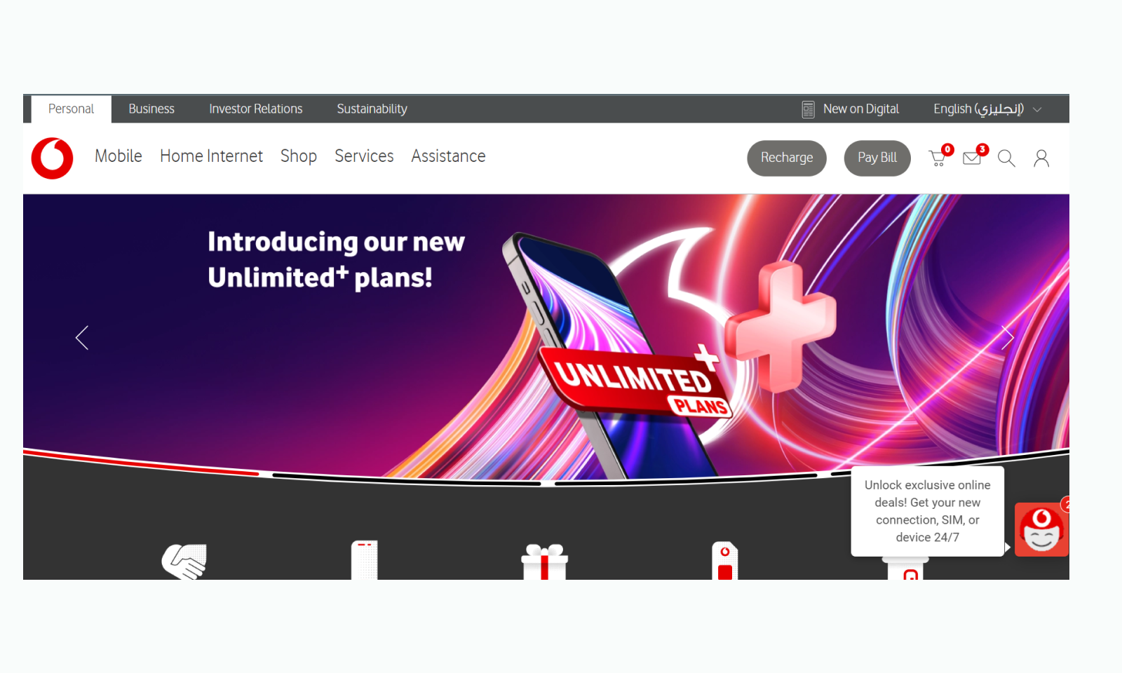
The goal was to capture Vodafone’s vision of global connectivity and leadership in telecommunications through a refined, modern interface.
This redesign features a visually engaging hero section with clear calls-to-action and optimized content structure

Challenges & Opportunities.
Problem: The Vodafone Qatar website faces challenges with SEO optimization due to a missing H1 header, responsiveness issues from grid elements that crop visuals on smaller screens, inconsistent design with mixed corner styles, and a plain font that doesn’t fully capture Vodafone’s dynamic global brand image.
Solution: The redesigned Vodafone Qatar website improves SEO with an H1 header, achieves full responsiveness through optimized grids, establishes a unified design language with consistent styling, and enhances user experience by implementing a refined typography and clear content hierarchy, aligning closely with the user expectations.
Result.
User-Friendly Interface: Intuitive UX/UI design that allows clients to access services and offers quickly.
Impact: Reduced content density, Improved Visual Hierachy, Responsive Layouts, Minimalisticl clean UI
Clean Design:This design offers a fresh minamilistic experience to the user
View Prototype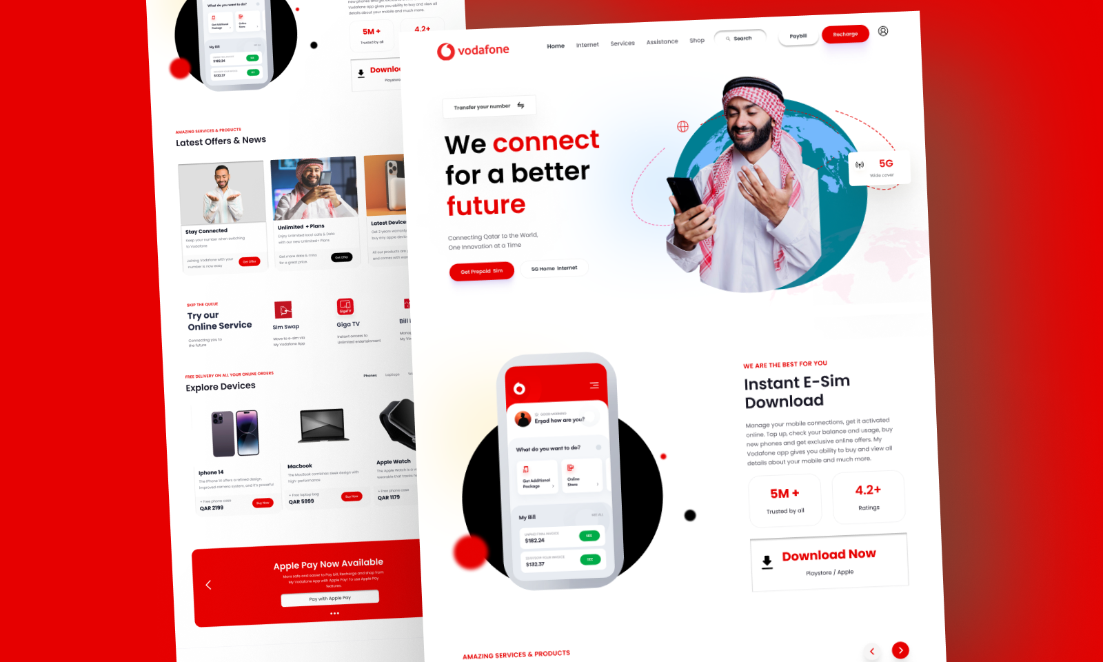

All change is hard at first, messy in the middle and gorgeous at the end.